Inclusive. Participatory. These are what we want the country’s growth to be. The past and present Philippine Development Plans (2010-2016, 2017-2022), and even the ones before them since 1986, have all included, in one way or another, this hope. The United Nations’ Millennium Development Goals and the successor Sustainable Development Goals are also grounded on inclusiveness and participation.
What inclusive and participatory means is that everyone should be sharing in the fruits of a country’s growth. Unfortunately, per our past two Plans, that has not been the case. The rich seem to be getting richer, and the poor have, at most, remained mired in poverty.
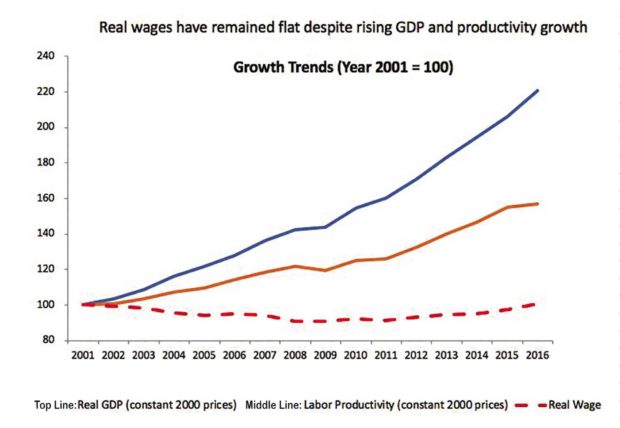
I have written about this before, Reader, but now I will show you a picture, or rather a graph, that, I hope, burns into your memory as it proves the point. I got this graph from the World Bank sometime ago, but I was reminded of it again because, in a briefing to the UPSE Alumni Association members earlier this week, Bangko Sentral ng Pilipinas Assistant Governor Francis Dakila also made similar observations. (BSP Governor Nestor Espenilla, who hosted the occasion, and Francis, and a lot of other BSP career employees, are also UPSE alumni).
See the graph (center) in all its glory.
Its title says it all: “Real wages have remained flat despite rising GDP and productivity growth.” GDP means gross domestic product, which is the total market value of all final goods and services produced within the country in a given year (or other period of time). We are all familiar with GDP.
Productivity is a concept we may not be as familiar with. In this case, we are talking about labor productivity, which is total output (GDP) divided by labor inputs. It increases if the same quantity of inputs produce more output, and it increases because of improved technology, improvements in labor skills, or capital deepening.
Real wages is defined as the purchasing power of a worker’s wages in terms of goods and services, or a worker’s nominal wages corrected for inflation.
Have we got all that, Reader? Now let’s look at the graph. The horizontal axis measures time, years from 2001 to 2016. The vertical axis measures the indices of GDP, Labor Productivity and Real Wages, all in constant 2000 prices. Notice that, in 2001, their indices are all 100. So it is easy to see how fast these are growing relative to one another.
Stay with me, Reader. Note the topmost line, which is Real GDP. Its index has gone from 100 to around 220 in the time period. That means GDP has more than doubled in that time. The growth rate of that line is about 5.4 percent a year on the average.
Now the second line represents labor productivity. The index of labor productivity increased by 57 percent during the period, with an average growth rate of 3.1 percent a year.
Finally, Reader, you have the real wage, represented by the broken line at the bottom of the graph. In 2001, the index of real wages was 100. In 2016, the index was also 100. It remained flat. Well, not really flat, because in seven out of the 15 years we are measuring, the index registered negative growth. That means the workers’ purchasing power was reduced during those years.
Now, Reader, look at the graph again. See the growing difference between real wages and productivity growth? The thing is, real wages should reflect productivity growth. If labor productivity is growing, real wages should also be growing. But, as you can see, over the past 15 years, that has not been the case.
To put it bluntly, it is clear as a bell that our workers have been screwed. What should have gone to them has gone to the capitalists instead.
solita_monsod@yahoo.com

